ToolGUI
This Go package provides a framework for rapidly building interactive data dashboards and web applications. It aims to offer a similar development experience to Streamlit for Python users.
⚠️ Under Development:
The API for this package is still under development, and may be subject to changes in the future.
Demo page: https://toolgui-demo.fly.dev/
Server-Client
Step by step Hello World
- Create
main.go:
package main

import (
	"github.com/mudream4869/toolgui/toolgui/tgcomp"
	"github.com/mudream4869/toolgui/toolgui/tgexec"
	"github.com/mudream4869/toolgui/toolgui/tgframe"
)

func main() {
	app := tgframe.NewApp()
	app.AddPage("index", "Index", func(p *tgframe.Params) error {
		tgcomp.Text(p.Main, "Hello world")
		return nil
	})

	e := tgexec.NewWebExecutor(app).StartService(":3001")
}
- Create go.mod and download toolgui:
go mod init toolgui-helloworld
go mod tidy
- Run helloworld
go run main.go
Explain
- Create a ToolGUI App: The
Appintance include the info that app needs.
app := tgframe.NewApp()
- Register a page in App: Tell
Appinstance, we will have a page in the App.indexis the name.Indexis the title.
app.AddPage("index", "Index", ...)
- The Page Func: Draw a text component in the Main container.
func(p *tgframe.Params) error {
	tgcomp.Text(p.Main, "Hello world")
	return nil
}
- WebExecuter: The
Apponly includes the logic of app, but not includes GUI. The we executer provide web server GUI interface forApp.
tgexec.NewWebExecutor(app).StartService(":3001")
How it works?
Basic
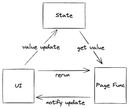
The key concept is that in the Page Function, the UI component interact immediately with the running logic.
For example:
if tgcomp.Button(p.State, p.Main, "Click me") {
    tgcomp.Text(p.Main, "Hi")
}
In the first call (For example: When the web page is entering.),
The Click me button will render, but the Hi will not render.
Since the button is not clicked in the first round.
When the user clicks the button, the Page Function will be called again.
In this round, tgcomp.Button will return true and Hi will render.
How?
Since we delcare a button which its id is Click me, and when the button clicked,
we store true with key Click me into p.State.
When entering tccinput.Button, it will check if there is any data store
in p.State with key Click me.
Server-Client Architecture
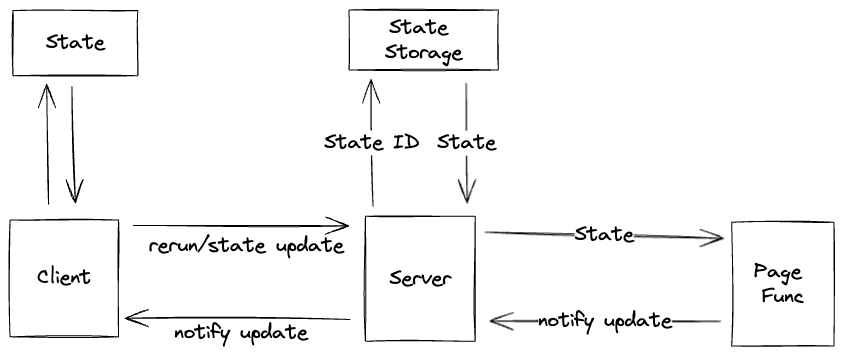
Server-Client need to handle a more complex part: multiple state for multiple users.
Hence we need a state_id for each state.
The server part is responsible for the state pool.
App
The App includes the info of
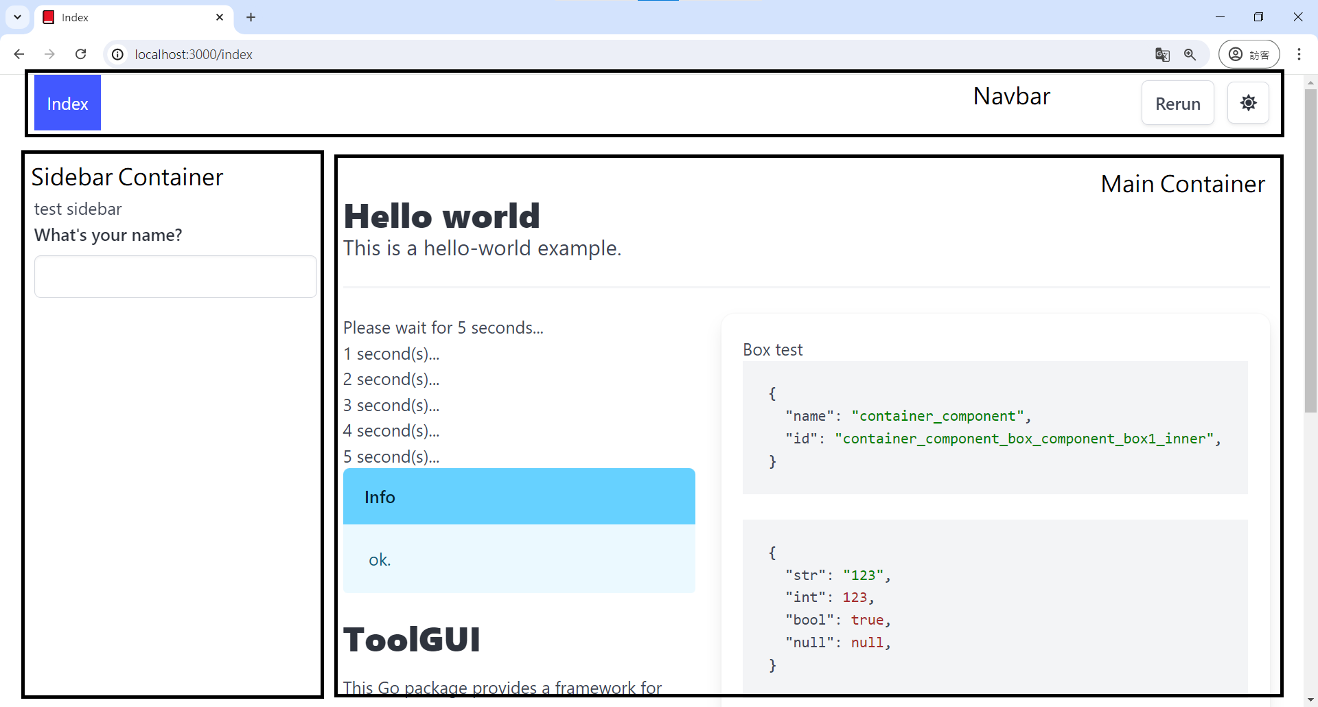
Navbar
Here is the navbar of toolgui-demo.

The left part will be buttons which nav to the pages in App. The right part will be two button:
- Rerun: Rerun the Page Func without changing any state.
- Dark/Light Mode Switch
The button of current page will be highlighted with a specific style.
Page
Parameters
We can config the page's:
-
Name: Or ID. The name of the page should be unique. In the web GUI provider, the name of a page will be used as the path of the page.
-
Title: In the web GUI provider, The title of a page will be used as the title of the page and text of button on the navbar.
-
Emoji: Optional. The emoji will be used as a icon on navbar and browser favicon.
The config type in package is:
type PageConfig struct {
	Name  string `json:"name"`
	Title string `json:"title"`
	Emoji string `json:"emoji"`
}
Page Function
The function signature of Page Function is defined as:
type RunFunc func(p *Params) error
Where Params contains these parameters to operate the page:
type Params struct {
	State   *State
	Main    *Container
	Sidebar *Container
}
Main and Sidebar is the root container component of the main and sidebar part
shown in the layout image.
We can show a text in the Main container by:
tgcomp.Text(p.Main, "Hello")
The State in Params provided for
- The component that need to pass state. For example: the checked state of checkbox.
- The state that user need to store. For example: The todo items in the Todo App.
Example for adding a page
- No emoji icon
app.AddPage("index", "Index", Main)
- With a emoji icon
app.AddPageByConfig(&tgframe.PageConfig{
	Name:  "page2",
	Title: "Page2",
	Emoji: "🔄",
}, Page2)
State Storage
-
Faster access: Frequently used data can be retrieved from the cache much faster than recalculating it or fetching it from an external source every time. This improves the application's overall performance.
-
Reduced resource usage: By avoiding redundant calculations and external data fetching, the app can conserve resources like CPU and network bandwidth.
App Cache
An app-level cache stores data for the entire duration of the application's execution, from launch to termination.
This cache is not provided by ToolGUI and needs to be implemented by the developer.
For example:
type App1 struct {
	sync.Map data
}

func (app *App) QueryData(key string) {
	if v, ok := data.Load(key); ok{
		return v
	}

	// ...
	v, _ := data.LoadOrStore(key, calVal)
	return v
}

func (app *App) Page1(...) {
	tgcomp.text(app.QueryData(...))
}
Additional Considerations:
-
Cache Invalidation: As the application runs, the underlying data sources might change. It's crucial to have a strategy to invalidate cached data when necessary to ensure consistency. This could involve periodically refreshing the cache or implementing mechanisms to detect changes in the source data.
-
Memory Usage: App-level caches can consume memory. It's essential to choose appropriate data structures and cache eviction policies to balance performance gains with memory constraints.
State Cache
State-level cache stores data specific to the current view or "page" displayed to the user. This data lost when the user navigates away from the page or refreshes it.
Here we provide a state-level TODO App example. It stores list of todos in the state:
func Main(p *tgframe.Params) error {
	tgcomp.Title(p.Main, "Example for Todo App")

	var todos []string
	err := p.State.GetObject("todos", &todos)
	if err != nil {
		return err
	}

	inp := tgcomp.Textbox(p.State, p.Main, "Add todo")
	if tgcomp.Button(p.State, p.Main, "Add") {
		todos = append(todos, inp)
		p.State.Set("todos", todos)
	}

	for i, todo := range todos {
		tgcomp.TextWithID(p.Main,
			fmt.Sprintf("%d: %s", i, todo),
			fmt.Sprintf("todo_%d", i))
	}

	return nil
}
Components
Component Tree / Forest
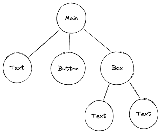
When every component created, we need to assign where it should generate. The root will be Main Container or Sidebar Container. Hence the relation between components is trees.
For example, if a page function implements as:
tgcomp.Text(p.Main, "Text")
tgcomp.Button(p.State, p.Main, "Button")
box := tgcomp.Box("box")
tgcomp.Text(box, "Text1")
tgcomp.Text(box, "Text2")
Then the Component Tree will be:
Content Components
The content components show basic content. It doesn't return any value to user.
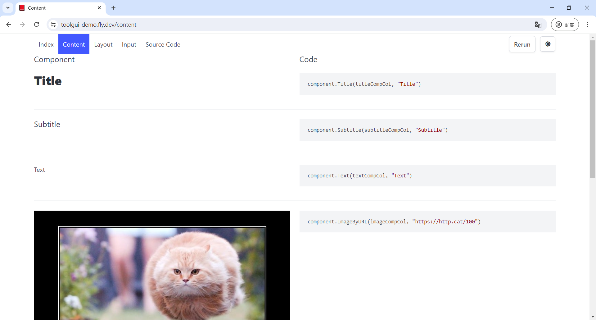
The demo page can be found here: https://toolgui-demo.fly.dev/content
Title
Title component display a title.
API
func Title(c *tgframe.Container, text string)
func TitleWithID(c *tgframe.Container, text string, id string)
cis Parent container.textis the title text.idis a user specific element id.
Example
tgcomp.Title(p.Main, "Title")

Subtitle
Subtitle component display a subtitle.
API
func Subtitle(c *tgframe.Container, text string)
func SubtitleWithID(c *tgframe.Container, text string, id string)
cis Parent container.textis the subtitle text.idis a user specific element id.
Example
tgcomp.Subtitle(p.Main, "Subtitle")

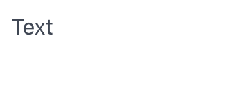
Text
Text component display a text.
API
func Text(c *tgframe.Container, text string)
func TextWithID(c *tgframe.Container, text string, id string)
cis Parent container.textis the text.idis a user specific element id.
Example
tgcomp.Text(p.Main, "Text")
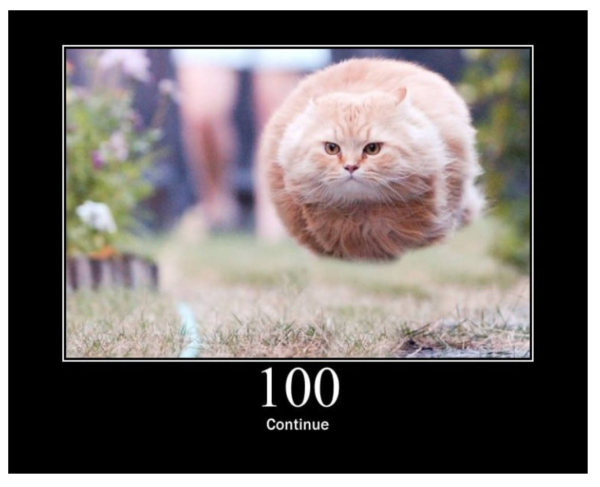
Image
Image component display an image.
API
func Image(c *tgframe.Container, img image.Image)
func ImageByURI(c *tgframe.Container, uri string)
cis Parent container.imgis the image.uriis the URI form of the image. Example:- URL:
https://http.cat/100 - base64 uri:
data:image/png;base64,...
- URL:
Example
tgcomp.ImageByURI(p.Main, "https://http.cat/100")
Divider
Divider component display a horizontal line.
API
func Divider(c *tgframe.Container)
func DividerWithID(c *tgframe.Container, id string)
cis Parent container.idis a user specific element id.
Example
tgcomp.Divider(p.Main)

Link
Link component display a link.
API
func Link(c *tgframe.Container, text, url string)
func LinkWithID(c *tgframe.Container, text, url, id string)
cis Parent container.textis the link text.urlis the link url.idis a user specific element id.
Example
tgcomp.Link(p.Main, "Link", "https://www.example.com/")

Download Button
DownloadButton create a download button component.
API
func DownloadButton(c *tgframe.Container, text string, body []byte, filename string)
func DownloadButtonWithID(c *tgframe.Container, text string, body []byte, filename, id string)
cis Parent container.textis the link text.bodyis the bytes of file.idis a user specific element id.
Example
tgcomp.DownloadButton(p.Main,
    "Download", []byte("123"), "123.txt")

Data Components
The data components display data in some special form.
import "github.com/mudream4869/toolgui/toolgui/tgcomp"
The demo page can be found here: https://toolgui-demo.fly.dev/data
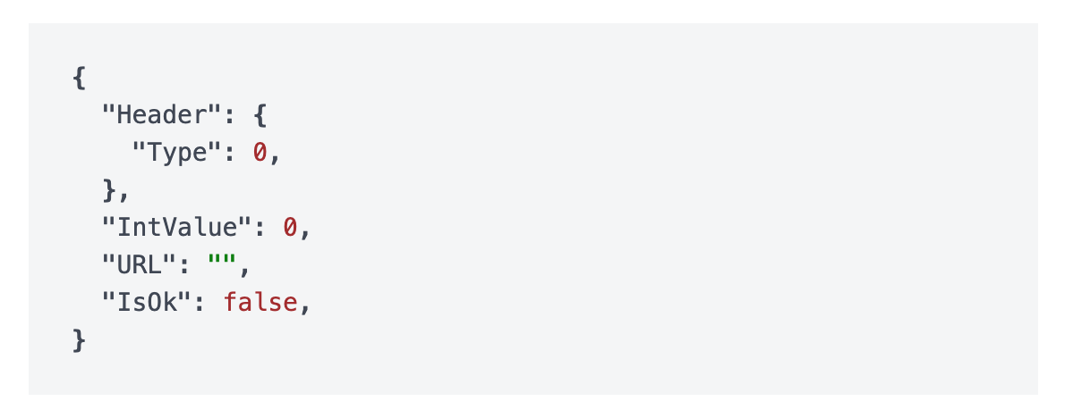
JSON
JSON component display the JSON representation of an object.
API
func JSON(c *tgframe.Container, v any)
cis Parent container.vis the object.
Example
type DemoJSONHeader struct {
	Type int
}

type DemoJSON struct {
	Header   DemoJSONHeader
	IntValue int
	URL      string
	IsOk     bool
}

tgcomp.JSON(p.Main, &DemoJSON{})
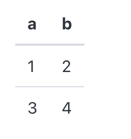
Table
Table component display a table.
API
func Table(c *tgframe.Container, head []string, table [][]string)
cis Parent container.headis the head of table.bodyis the body of table.
Example
tgcomp.Table(p.Main, []string{"a", "b"}, [][]string{{"1", "2"}, {"3", "4"}})
Input Components
The input components provide UI for app-user to input their data.
import "github.com/mudream4869/toolgui/toolgui/tgcomp"
The demo page can be found here: https://toolgui-demo.fly.dev/input
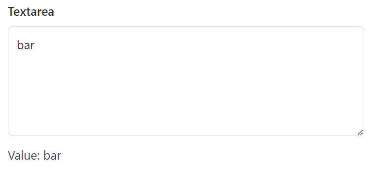
Textarea
Textarea create a textarea and return its value.
API
func Textarea(s *tgframe.State, c *tgframe.Container, label string, height int) string
sis State.cis Parent container.labelis the label for textbox.heightis heigh of the textarea.
Example
textareaValue := tgcomp.Textarea(p.State, p.Main, "Textarea", 5)
tgcomp.TextWithID(p.Main, "Value: "+textareaValue, "textarea_result")
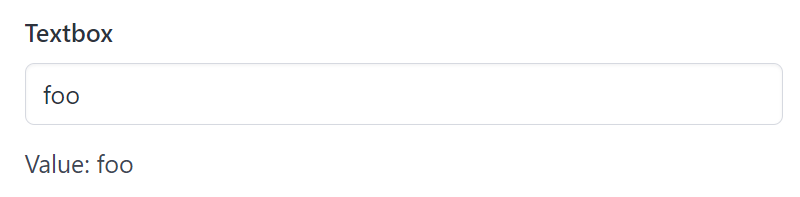
Textbox
Textbox create a textbox and return its value.
API
func Textbox(s *tgframe.State, c *tgframe.Container, label string) string
sis State.cis Parent container.labelis the label for textbox.
Example
textboxValue := tgcomp.Textbox(p.State, p.Main, "Textbox")
tgcomp.TextWithID(p.Main, "Value: "+textboxValue, "textbox_result")
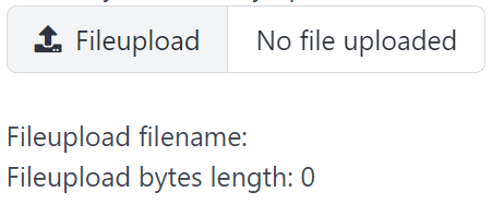
Fileupload
Fileupload create a fileupload and return its selected file.
API
type FileObject struct {
	Name string `json:"name"`
	Type string `json:"type"`
	Size int    `json:"size"`

	Bytes []byte `json:"_"`
}

func Fileupload(s *tgframe.State, c *tgframe.Container, label string) FileObject
sis State.cis Parent container.labelis the label for options group.
Example
fileObj := tgcomp.Fileupload(p.State, p.Main, "Fileupload")
tgcomp.Text(p.Main, "Fileupload filename: "+fileObj.Name)
tgcomp.Text(p.Main, fmt.Sprintf("Fileupload bytes length: %d", len(fileObj.Bytes)))
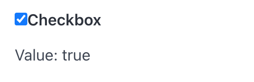
Checkbox
Checkbox create a checkbox and return true if it's checked.
API
func Checkbox(s *tgframe.State, c *tgframe.Container, label string) bool
sis State.cis Parent container.labelis the text on checkbox.
Example
checkboxValue := tgcomp.Checkbox(p.State, p.Main, "Checkbox")
if checkboxValue {
	tgcomp.TextWithID(p.Main, "Value: true", "checkbox_result")
} else {
	tgcomp.TextWithID(p.Main, "Value: false", "checkbox_result")
}
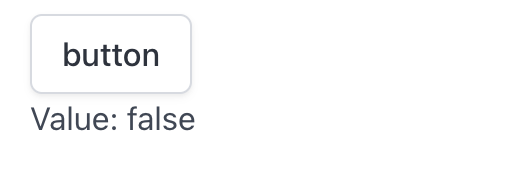
Button
Button create a button and return true if it's clicked.
API
func Button(s *tgframe.State, c *tgframe.Container, label string) bool
sis State.cis Parent container.labelis the text on button.
Example
btnClicked := tgcomp.Button(p.State, p.Main, "button")
if btnClicked {
	tgcomp.TextWithID(p.Main, "Value: true", "button_result")
} else {
	tgcomp.TextWithID(p.Main, "Value: false", "button_result")
}
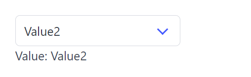
Select
Select create a select dropdown list and return its selected value.
API
func Select(s *tgframe.State, c *tgframe.Container, label string, items []string) string
sis State.cis Parent container.labelis the label for select.itemsis the list of options.
Example
selValue := tgcomp.Select(p.State, p.Main, "Select", []string{"Value1", "Value2"})
tgcomp.TextWithID(p.Main, "Value: "+selValue, "select_result")
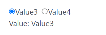
Options
Radio create a group of radio items and return its selected value.
API
func Radio(s *tgframe.State, c *tgframe.Container, label string, items []string) string
sis State.cis Parent container.labelis the label for options group.itemsis the list of options.
Example
radioValue := tgcomp.Radio(p.State, p.Main, "Radio", []string{"Value3", "Value4"})
tgcomp.TextWithID(p.Main, "Value: "+radioValue, "radio_result")
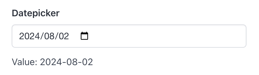
Datepicker
Datepicker create a datepicker and return its selected date.
API
func Datepicker(s *tgframe.State, c *tgframe.Container, label string) string
sis State.cis Parent container.labelis the label for datepicker.
Example
dateValue := tgcomp.Datepicker(p.State, p.Main, "Datepicker")
tgcomp.TextWithID(p.Main, "Value: "+dateValue, "datepicker_result")
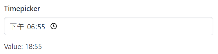
Timepicker
Timepicker create a timepicker and return its selected time.
API
func Timepicker(s *tgframe.State, c *tgframe.Container, label string) string
sis State.cis Parent container.labelis the label for timepicker.
Example
dateValue := tgcomp.Datetimepicker(p.State, p.Main, "Datetimepicker")
tgcomp.TextWithID(p.Main, "Value: "+dateValue, "datetimepicker_result")
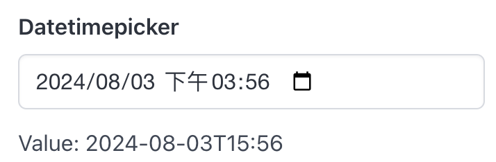
Datetimepicker
Datetimepicker create a datetimepicker and return its selected datetime.
API
func Datetimepicker(s *tgframe.State, c *tgframe.Container, label string) string
sis State.cis Parent container.labelis the label for datetimepicker.
Example
dateValue := tgcomp.Datetimepicker(p.State, p.Main, "Datetimepicker")
tgcomp.TextWithID(p.Main, "Value: "+dateValue, "datetimepicker_result")
Layout Components
The layout components display control component layout and position.
import "github.com/mudream4869/toolgui/toolgui/tgcomp"
The demo page can be found here: https://toolgui-demo.fly.dev/layout
Container
Container is the most basic layout component. Their definition are in tgframe. The Main "container" and Sidebar "container" are Containers.
Usage
To create a container under a container. Just call the function:
func (c *Container) AddContainer(id string) *Container
- ID should be unique.
Box
Box provide a simple container that show box style.
Usage
Box create a box container.
func Box(c *tgframe.Container, id string) *tgframe.Container
c: Parent container.id: Unique component ID.
Example
box := tgcomp.Box(boxCompCol, "box")
tgcomp.Text(box, "A box!")
Column
Column provides columns layout.
Usage
- Column create N columns.
- Column2 create 2 columns.
- Column3 create 3 columns.
func Column(c *tgframe.Container, id string, n uint) []*tgframe.Container
func Column2(c *tgframe.Container, id string) (*tgframe.Container, *tgframe.Container)
func Column3(c *tgframe.Container, id string) (*tgframe.Container, *tgframe.Container, *tgframe.Container)
c: Parent container.id: Unique component ID.n: Number of column.
Example
cols := tgcomp.Column(colCompCol, "cols", 3)
for i, col := range cols {
	tgcomp.Text(col, fmt.Sprintf("col-%d", i))
}